Make the site feel like the front door to a serious product company.
This direction borrows Cursor's restraint, premium spacing, and product confidence. Developers Digest stops looking like a collection of content blocks and starts looking like a studio that ships software, teaches workflows, and packages them into products.
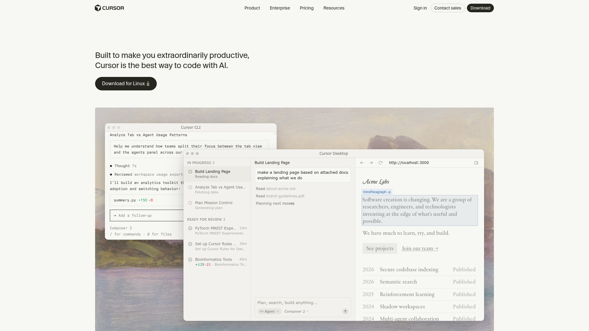
devdigest ship homepage

> direction: product-studio
> tone: premium, restrained, fast
> modules:
  - apps directory
  - courses
  - comparison tools
  - weekly releases
  - design concepts

Result:
  fewer sections
  stronger hierarchy
  clearer product story
  easier theme-pack swaps
The first screen should sell the DevDigest operating stack: apps, CLI, courses, and tools working together.
- Condense social proof into smaller evidence blocks.
- Move the app ecosystem higher.
- Use fewer but stronger calls to action.
This concept is intentionally built from variables: background, surface, line, text, accent, radius, and shadow. That is the path to hot-swapping without rebuilding every page by hand.
- Keep content modules stable.
- Swap tokens and a small set of layout primitives.
- Promote successful concepts into React components later.
The risk with this direction is becoming too safe. The correction is to keep the clean structure, then inject sharper DevDigest-specific product copy and stronger app ecosystem cards.
- Use product language over creator fluff.
- Show real shipped surfaces.
- Treat design concepts as a visible lab.
Used for restraint, premium spacing, and the feeling that every section is deliberate.
Keep concept HTMLs standalone while exploring. Once one wins, extract tokens plus 4-6 stable section primitives into the real app and let content drive the rest.