Design System
The hard-edged neutral system
The visual language behind Developers Digest: white surfaces, hairline borders, square corners, mono uppercase eyebrows, at most one accent, and no gradients. Inspired by tools like Vercel and Linear. Everything you need to build with the brand.
This replaced the retired cream-and-pink "Gumroad" system in July 2026. See the redesign write-up for the full story.
For AI agents
Copy the current design contract and hand it to an agent, or preview it.
Brand
Logo & Assets
Wordmark - Light
DEVDIGEST
Wordmark - Dark
DEVDIGEST
Avatar
Lockup
Clearspace
Maintain at least 1x the avatar height as clearspace around the logo on all sides.
1x
1x
1x
1x
Foundation
Colors
Click any swatch to copy the hex value.
Neutral scale
There is no brand hue. Default to black; at most one accent color appears on one element, never a spread of colored states.
Foundation
Typography
Headings: Geist with tight tracking. Section labels: monospaced, uppercase, wide tracking.
Size and weight create hierarchy. Semibold for headings, regular for body.
72pxDisplay
Aa
60pxH1
Heading One
36pxH2
Heading Two
24pxH3
Heading Three
20pxLarge
Large body text
16pxBody
Regular body copy for paragraphs and general content.
14pxSmall
Labels, metadata, captions
12pxEyebrow
SECTION LABEL
Components
Buttons
Square corners, no pills. Solid black primary or hairline secondary. One accent at most.
Variants
Sizes
Code
<!-- Primary (solid black, square) -->
<button class="inline-flex h-11 items-center border border-black bg-black
  px-6 text-sm font-medium text-white hover:bg-neutral-800
  transition-colors">
  Get Started
</button>

<!-- Secondary (hairline, square) -->
<button class="inline-flex h-11 items-center border border-black/15 bg-white
  px-6 text-sm font-medium text-black hover:bg-neutral-50
  transition-colors">
  Learn More
</button>
Components
Cards
A white surface with a hairline border. Structure comes from the border, not shadows or offset layers. Square corners throughout.
Standard
Card Title
White surface, hairline border-black/10, square corners.
Emphasis
Emphasis
A slightly stronger hairline (border-black/15) is the only emphasis needed.
Interactive
Hover me
Hover shifts the surface to neutral-50. No lift, no shadow.
Code
<!-- Standard card -->
<div class="border border-black/10 bg-white p-6">
  Content
</div>

<!-- Interactive card -->
<div class="border border-black/10 bg-white p-6
  hover:bg-neutral-50 transition-colors cursor-pointer">
  Hover content
</div>
Foundation
Spacing
8px base unit. All spacing derives from this.
4pxp-1
8pxp-2
12pxp-3
16pxp-4
24pxp-6
32pxp-8
40pxp-10
48pxp-12
64pxp-16
80pxp-20
Foundation
Corners
Square, everywhere. globals.css forces border-radius: 0 and sets the radius token to zero, so no component can quietly reintroduce curves. Hard edges are the single most recognizable signal of the system.
Everything0pxrounded-none
Components
Forms
<input
  class="border border-black/15 bg-white px-3 py-2
    focus:border-black focus:outline-none"
  placeholder="Enter email"
/>
Guidelines
Rules
Do
- Square corners everywhere
- Hairline borders (border-black/10) for structure
- Mono uppercase eyebrows on section labels
- One accent at most, default black
- Let type and spacing carry hierarchy
- Solid neutrals only
Don't
- No gradients, anywhere
- No rounded pills or curved corners
- No offset-layer or heavy-shadow cards
- No cream surfaces or pink accents (retired)
- No emojis, no em dashes
- No rainbow of colored states
Reference
Design Tokens
Click any token value to copy it.
| Token | CSS Variable | Tailwind | Value |
|---|---|---|---|
| Background | --background | ||
| Foreground | --foreground | ||
| Secondary text | -- | ||
| Hairline border | -- | ||
| Emphasis border | -- | ||
| Muted surface | -- | ||
| Radius | --radius | ||
| Button height | -- | ||
| Card padding | -- | ||
| Section padding | -- |
Assets
Infographics
Editorial illustration assets used as hero images and inline visuals. These are drawn in a warm, hand-made style on purpose - the illustration language is intentionally distinct from the hard-edged neutral UI chrome, which stays reserved for the interface itself.

Multi-Agent Coordination Architecture

The Agentic Development Stack

Context Window Management

AI Code Review Pipeline

Claude Code vs Cursor vs Codex
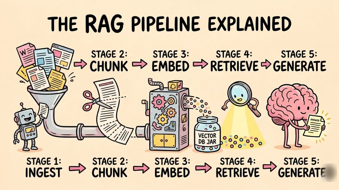
The RAG Pipeline Explained
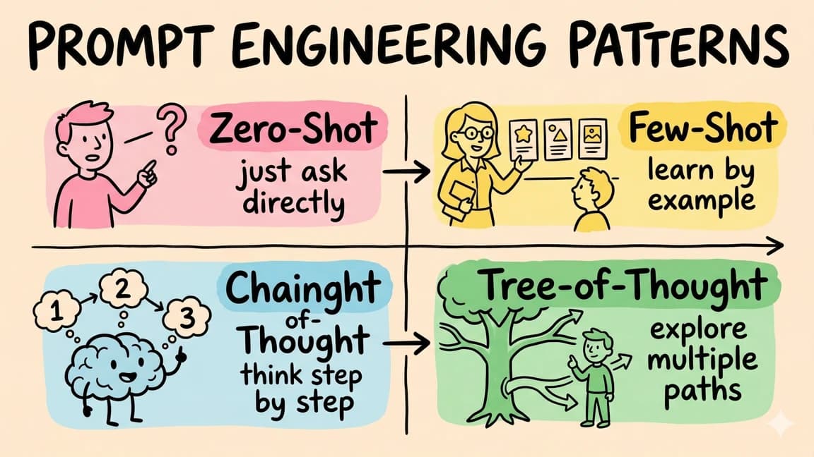
Prompt Engineering Patterns

MCP (Model Context Protocol) Architecture

AI Agent Memory Systems

The Fine-Tuning Decision Tree

Vibe Coding vs Traditional Coding

Token Economics for AI Models

The AI Testing Pyramid

LLM Hallucination Detection

The AI Deployment Pipeline

Embedding Models Explained

AI Guardrails and Safety for LLM Applications

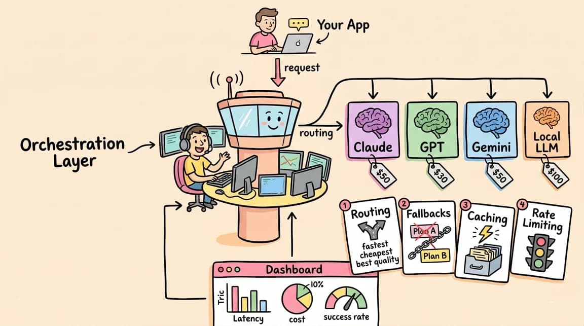
The LLM Orchestration Layer
Structured Output Parsing for LLMs

The AI Developer Workflow Loop

The Model Distillation Pipeline
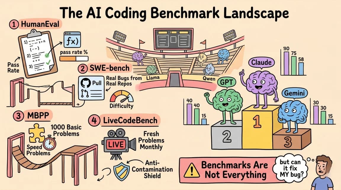
The AI Coding Benchmark Landscape

The Semantic Search Stack

AI Code Generation Patterns

Mercury 2: The Diffusion Language Model

Claude Code + Chrome Browser Automation
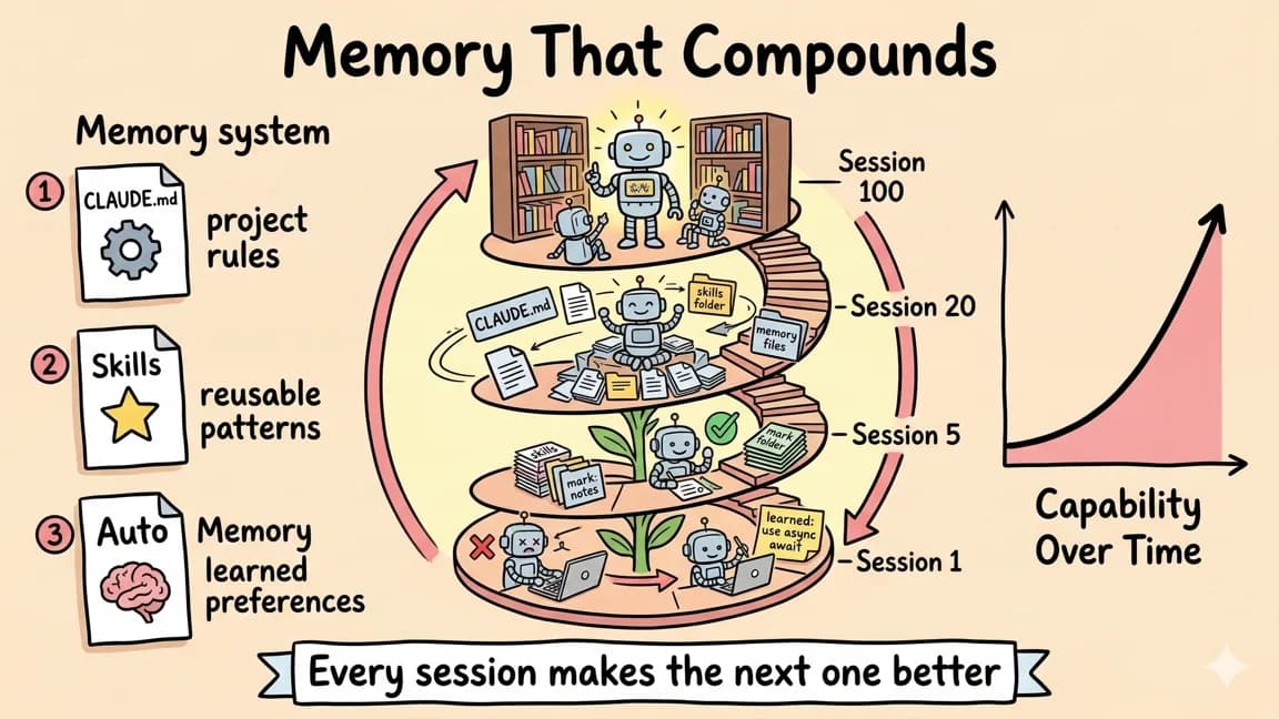
Continual Learning: Memory That Compounds
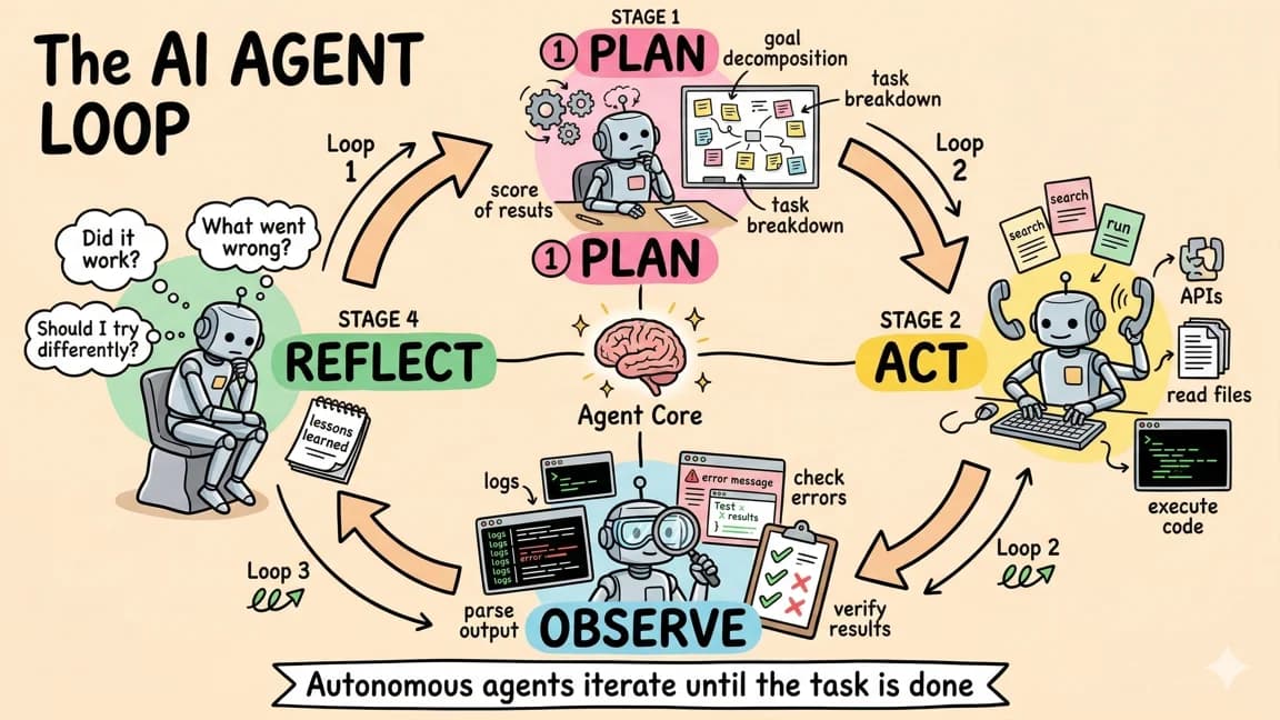
The AI Agent Loop
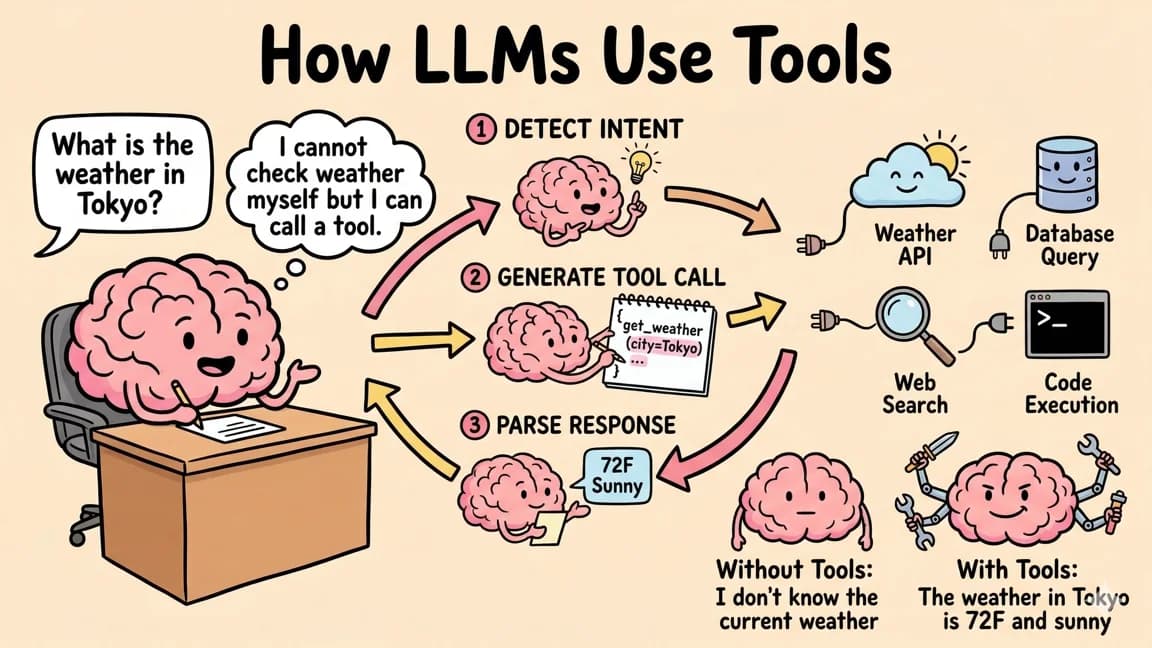
How LLMs Use Tools: Function Calling
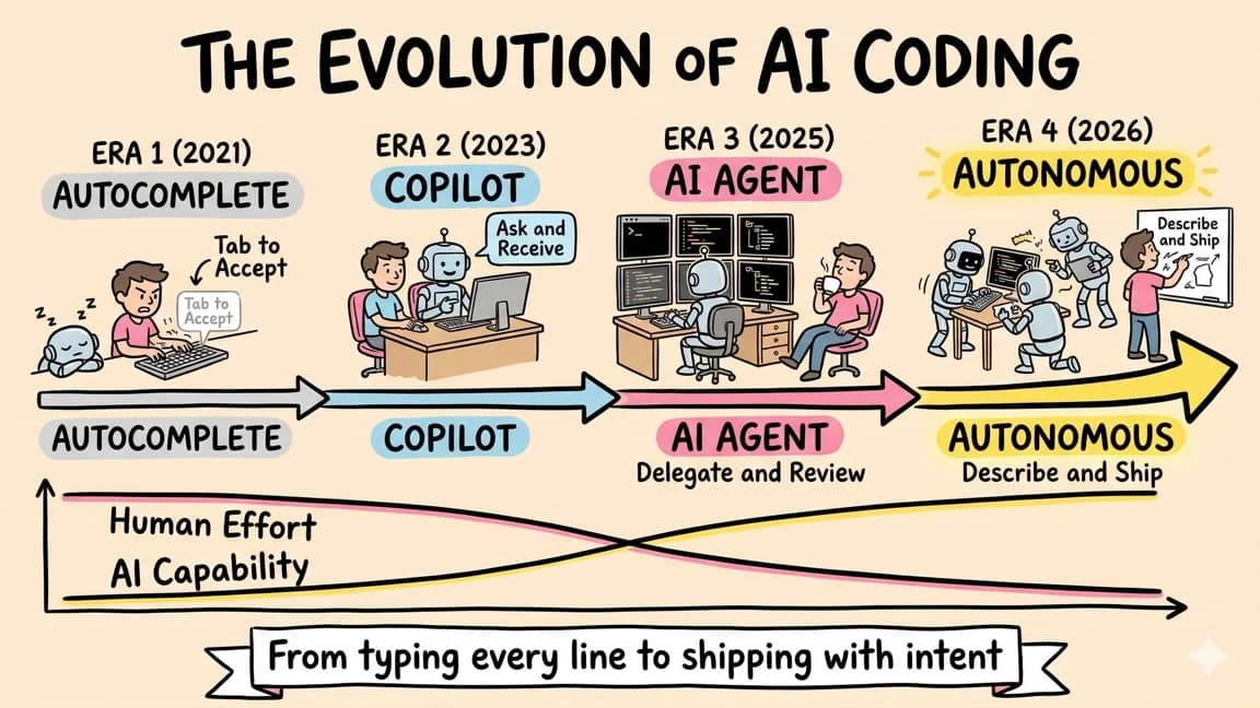
The Evolution of AI Coding

The Inference Stack: From Prompt to GPU
Reference
Component Patterns
The system leans on Tailwind utilities rather than bespoke classes. These are the canonical class strings to copy.
<!-- Section eyebrow -->
font-mono text-xs uppercase tracking-[0.18em] text-neutral-500

<!-- Primary button -->
inline-flex h-11 items-center border border-black bg-black px-6
  text-sm font-medium text-white hover:bg-neutral-800 transition-colors

<!-- Secondary button -->
inline-flex h-11 items-center border border-black/15 bg-white px-6
  text-sm font-medium text-black hover:bg-neutral-50 transition-colors

<!-- Card -->
border border-black/10 bg-white p-6

<!-- Card category tag (inverted chip) -->
inline-block bg-black text-white text-[10px] font-mono px-2 py-1
  uppercase tracking-[0.12em]
Retired 2026-07: the legacy btn-pill* and gumroad-card utilities still exist in globals.css for old pages, but do not use them on new surfaces.

Get Smarter About AI Dev
New tutorials, open-source projects, and deep dives on coding agents - delivered weekly.
One email per weekReal code, not theoryFree forever