We Redesigned Developers Digest: The Applied Story of Rebuilding a 1000-Page Site in a Day

Building in Public
2 parts- 1Coordinating an Agent Fleet for a Day: The Operating Model That Actually Held
- 2We Redesigned Developers Digest: The Applied Story of Rebuilding a 1000-Page Site in a DayCurrent
TL;DR
We retired the playful cream-and-pill design system for a hard-edged neutral, Vercel-inspired contract, and rebuilt the whole site in a day by coordinating parallel AI agents.
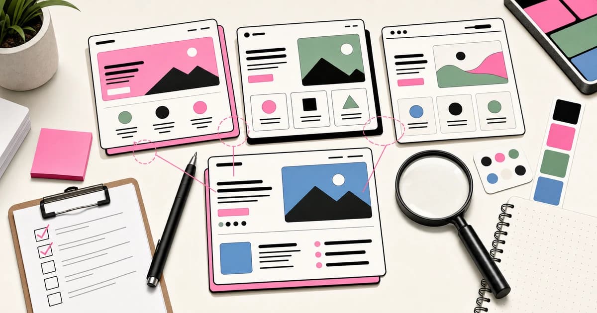
Developers Digest looks different today. We retired the old design system, the playful one built on cream surfaces, pink accents, rounded pills, and offset-layer cards, and replaced it with a hard-edged neutral contract that is closer in spirit to Vercel or Linear than to a Gumroad landing page. This post is the applied version of the story: why we changed direction, the exact constraints we committed to, how we actually built it by coordinating AI agents in parallel, and what comes next.
We write about coordinating AI agents. This redesign was a chance to do it on our own site, at real scale, in public.
Why we changed the design direction#
The old system was warm and friendly. It worked when the site was small. But Developers Digest is now more than a thousand pages: blog posts, tutorials, guides, a tools directory, courses, comparison surfaces, and programmatic SEO pages. At that scale, a decorative system starts to fight the content.
Three problems pushed the change:
- Content density. Comparison tables, pricing grids, and long technical posts want a calm, dense canvas. Rounded pills and cream cards add visual weight to every row. On a page with fifty data points, that weight becomes noise.
- Signal over decoration. Our readers are developers evaluating tools and workflows. They want to scan, compare, and decide. A design that foregrounds itself gets in the way of that job. We wanted the interface to disappear and the information to lead.
- Seriousness as an AI-dev authority. The goal is to be a durable, trusted reference for applied AI development. The visual language should read as an engineering reference, not a consumer marketing site.
None of that means the old system was wrong. It means the site outgrew it.
The constraints we chose#
A design system is only as good as the constraints it enforces. We picked a small set and applied them globally, with no exceptions per page.
- Square corners everywhere. The global stylesheet forces
border-radius: 0and sets the radius token to zero. No component can quietly reintroduce curves. Hard edges are the single most recognizable signal of the new look. - Hairline borders. Structure comes from thin
border-black/10lines, not shadows or filled cards. Sections are defined by rules, not by weight. - One accent at most. Default to black. Most pages use zero accent color and let typography and spacing carry the hierarchy. When an accent appears, it is one hue on one element, never a rainbow of states.
- Mono uppercase eyebrows. Section labels use a monospaced, uppercase, wide-tracked eyebrow. It is the typographic tell of the system and does a lot of hierarchy work for very little ink.
- No gradients, anywhere. No gradient backgrounds, text, borders, or badges. Solid neutrals only. Gradients are the fastest way to make an interface look generic, and banning them entirely removed a whole category of decisions.
The rules live in the project instructions so that every future change, human or agent, inherits them. That is the point: a constraint you have to remember is a constraint you will eventually break. A constraint the codebase enforces stays enforced.
How it was actually built#
Here is the honest part. This was not a solo weekend of hand-editing files. It was a coordinated run of parallel AI agents, which is exactly the discipline this site is about.
The stack is Next.js 16 with the App Router and Tailwind. The component layer adapts a set of Magic UI components, but every one of them was rewritten to the new contract: square, neutral, no gradients. We did not drop in a template and call it a redesign. We took useful primitives, like grid patterns, marquees, and bento layouts, and stripped them back to the hard-edged system.
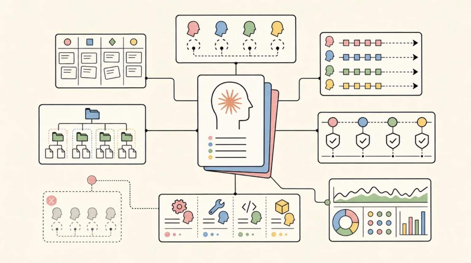
The work was decomposed into independent slices and handed to separate agents running at the same time. A rough shape of the fan-out:
- One track rebuilt the global tokens and base layout so every downstream page would inherit the new contract.
- Separate tracks took the homepage, the blog surfaces, the tools and comparison pages, the member dashboard, and the standalone product pages.
- Content tracks drafted and refreshed articles in parallel with the design work.
- A verification pass ran style checks, type checks, and route checks across the whole site so nothing regressed silently.
Coordinating agents this way is not free. The hard parts are the same hard parts as coordinating people: clear ownership boundaries so two agents do not fight over the same file, a shared contract so independent work still composes into one coherent system, and automated checks so you can trust the output without reading every diff by hand. The enforced design constraints did double duty here. Because square corners, hairline borders, and the no-gradient rule were codified, agents working on different pages produced work that looked like it came from one hand.
The verification loop mattered most. A machine-readable style check greps the codebase for banned patterns, em dashes among them, and the type and route checks confirm the site still builds and every page still responds. Those checks are what make parallel agent work safe to ship. Without them, fanning out just multiplies the surface area for silent breakage.
Rebuilding a thousand-page site in a day is only possible because the pages are not a thousand unique snowflakes. They are a handful of layouts driven by data and content. Fix the layouts and the contract, and the long tail follows automatically. The leverage is in the system, not in the page count.
What is next#
The redesign is the foundation, not the finish line. The next wave is member features:
- Credits. A universal credit balance that works across our tools, so the interactive surfaces on the site can do real work for signed-in members.
- In-app AI chat. A chat assistant, currently in beta, that lives inside the member dashboard and answers questions grounded in our content and tools.
Both are early. We are shipping them in public and will write about what works and what does not, the same way we did here.
If you want the running list of what shipped, the changelog has every entry with dates. And if you are trying to coordinate agents on your own codebase, the constraint-and-verification pattern above is the part worth copying: codify the rules, enforce them with checks, then let independent agents move fast inside the guardrails.
Frequently Asked Questions#
Why move away from the old cream-and-pink design?#
The site grew past a thousand pages of dense, comparison-heavy content. A warm, decorative system added visual weight to every element, which worked at small scale but started competing with the information at large scale. The hard-edged neutral system prioritizes scanability and reads as a serious engineering reference.
What is the new design system based on?#
It is a hard-edged neutral contract inspired by tools like Vercel and Linear: white surfaces, hairline border-black/10 borders, square corners enforced globally, monospaced uppercase eyebrows, at most one accent color, and no gradients anywhere. It is built with Next.js 16 and Tailwind, using adapted Magic UI components rewritten to fit the contract.
How was a thousand-page site rebuilt in a single day?#
The work was decomposed into independent slices, such as the homepage, blog, tools, dashboard, and content, and handed to separate AI agents running in parallel. Codified design constraints kept their output consistent, and automated style, type, and route checks made the parallel work safe to ship. The leverage came from a small number of shared layouts driving many pages, not from editing each page by hand.
Continue Reading#
Get the next deep dive like this in your inbox
One email a week on Design Systems and the rest of the AI dev stack. Free.
Read next on AI coding tools
Claude Design: Anthropic's Bet That Designers and Developers Want the Same Tool
Claude Design generates a full design system from your repo, ships one-shot pricing pages, and exports clean HTML/CSS to your coding agent. Here is what it actually does, where it slots in for developers, and why this is more interesting than another AI UI generator.
9 min readDESIGN.md: The Contract That Keeps AI Agents On Brand
A repo-root DESIGN.md gives Claude Code, Codex, and other agents the design rules they need to honor so generated UI does not drift into generic territory.
9 min readAI Design Slop: 16 Patterns That Out Your App as Vibe-Coded
AI design slop is the set of 16 landing page patterns that mark a site as vibe-coded. Adrian Krebs scored 1,590 Show HN pages: 22% heavy, 32% mild, 46% clean.
7 min readNew here? Start with
Technical content at the intersection of AI and development. Building with AI agents, Claude Code, and modern dev tools - then showing you exactly how it works.